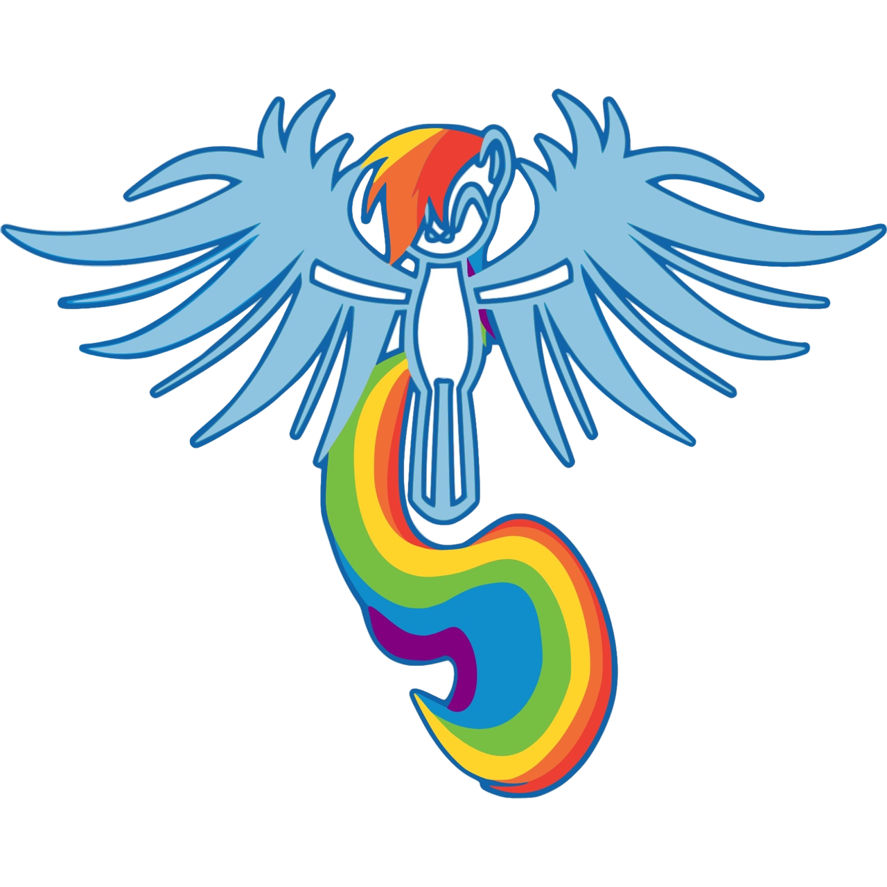
As much as the concept of an Angel Gown was a new concept to South Africa, all of this was scarily new to me as well. I had a long standing career in the fashion industry working with brides – TAGI is quite the contrast to this.
But nevertheless, once I committed to TAGI, my commitment became unwavering and I plunged head first into the world of infant death. I was overwhelmed with terminology and statistics that made absolutely no sense to me, but I mustered through it all.
With my corporate background I realized the importance of branding and so our logo was quickly a key factor that needed to be sorted. I checked in on our international counterparts and many of the logos just looked like more of the same. Baby pink, baby blue, wings and or feet in white. I was not inspired…
We are a South African first! Our logo should represent our uniqueness, while still paying tribute and respect to the families we help. Somewhere I got my signals crossed and misunderstood and I thought a baby passing away at birth is called a “Rainbow Baby” and immediately I wanted a rainbow in the logo.
I discussed some samples with a focus group and the recurring feedback is how beautiful all the colours are, especially in a time of such darkness, and I knew this was our logo! … And then the pros sat me down for a talk… I got a proper schooling in terminology.
So, first you get a Sunshine Baby – this is when your first birth is successful and the baby is born alive.
Angel Baby is the term used for a baby that passed away – now these are the babies we work with.
A Rainbow Baby is your first successful pregnancy after you had an Angel Baby.
Now I understand there are still many terminologies out there, but these are the key ones I had to deal with. I thought on it long and hard, discussed it to death and finally made my decision; I’m keeping the rainbow. Although I misunderstood and involved the wrong theme, the striking rainbow was positively talking to everyone. It is a touch of colour in time of darkness.
Like many things with TAGI, our logo keeps in the theme of happy accidents. This is one of those where it was meant to be. On an ironic note, about a year into TAGI someone asked me about it and I told her how it happened. She paused for a moment, giggled a little and she said that she always thought the rainbow was in there because I’m gay. I laughed so loudly as it was the first ever time I saw it in that light, lol.
At the end of the day everything is about perception, everyone has their own opinions and regardless of how it all came to be, I want to leave you with this “Our little rainbow brings a touch a colour to families going through the darkest of times”
Eric Elronde.

